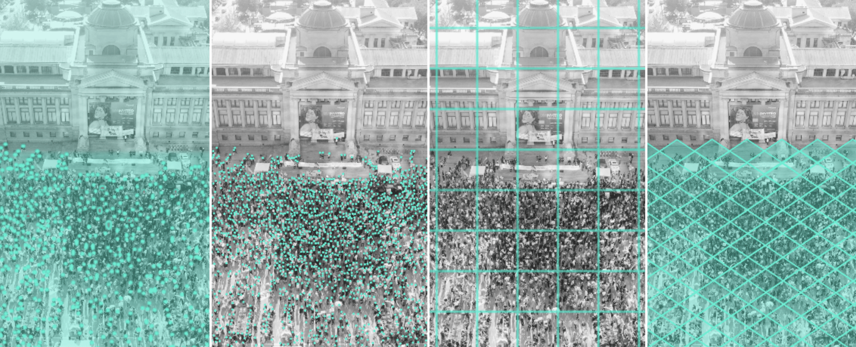
The idea for this project emerged after I noticed how differently media outlets reported crowd sizes for the same event. Estimates for that event varied by thousands, which led to confusion, public unrest, and increased polarization, as people divided based on which media outlet’s numbers they believed.
This made me wonder: Why is it so difficult to agree on a single crowd count? Don’t we have technology advanced enough to get it right?
That question, along with seeing how conflicting numbers can fuel division, motivated me to explore the issue more deeply.
I researched commonly used crowd counting methods and decided to test them myself.
Using a single image of a real crowd, I applied multiple counting techniques to compare their results.
Through this interactive project, you can explore how crowd size estimates change depending on the counting method used. Based on the results I obtained using each method, you can compare the final counts and see how much they differ. The project lets you go through each technique step by step, with simple visual explanations that make the methods easy to understand. Finally, there’s a small interactive tool that helps you discover the strengths and limitations of each approach: by selecting certain features of an image or scenario, you’ll get a recommendation for the most suitable counting method.
The project is not meant to offer a scientific guide to crowd counting, but rather to increase awareness of how data analysis and interpretation influence the information we receive and consume in the media to better navigate this complex world of information overload.
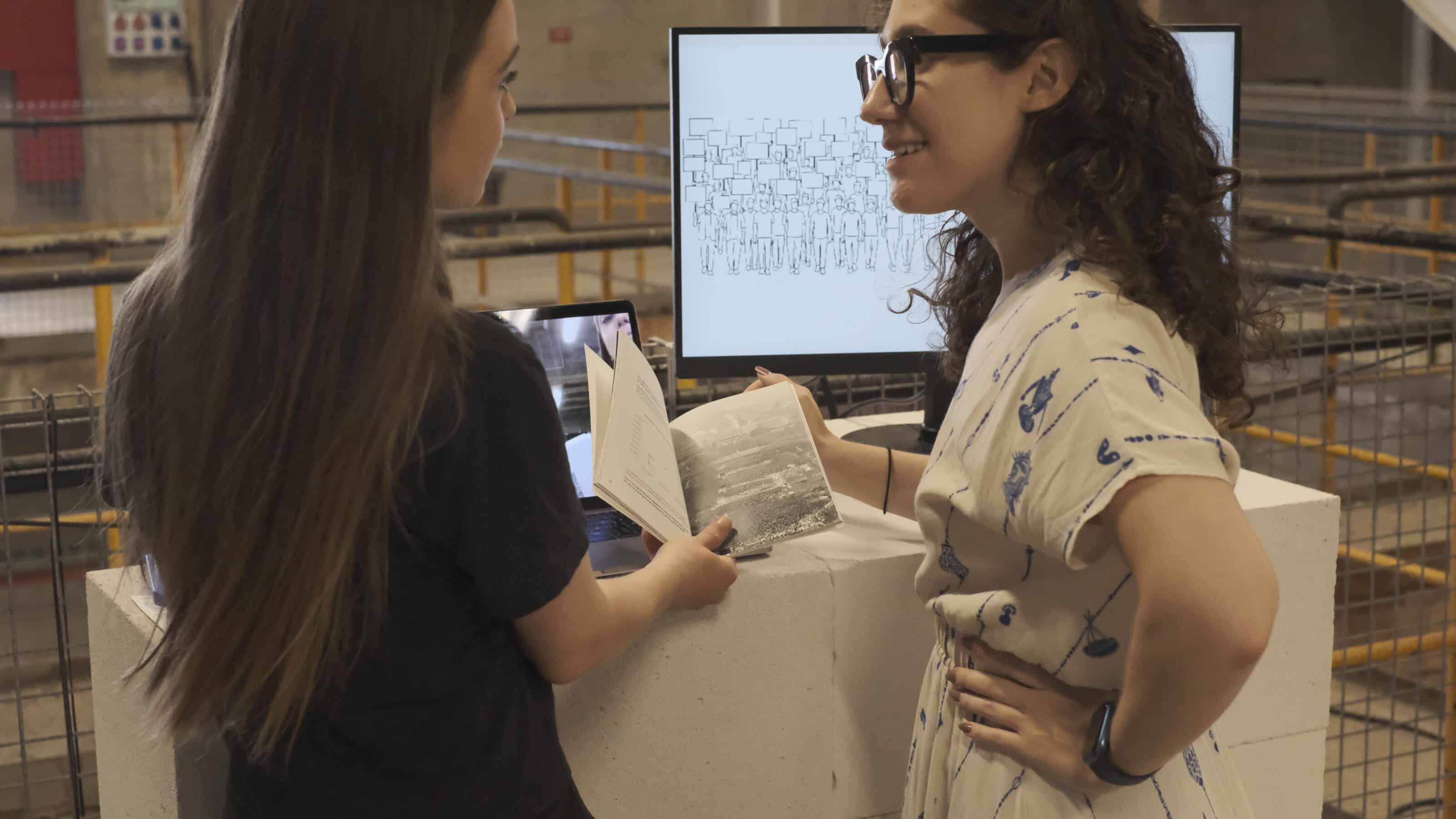
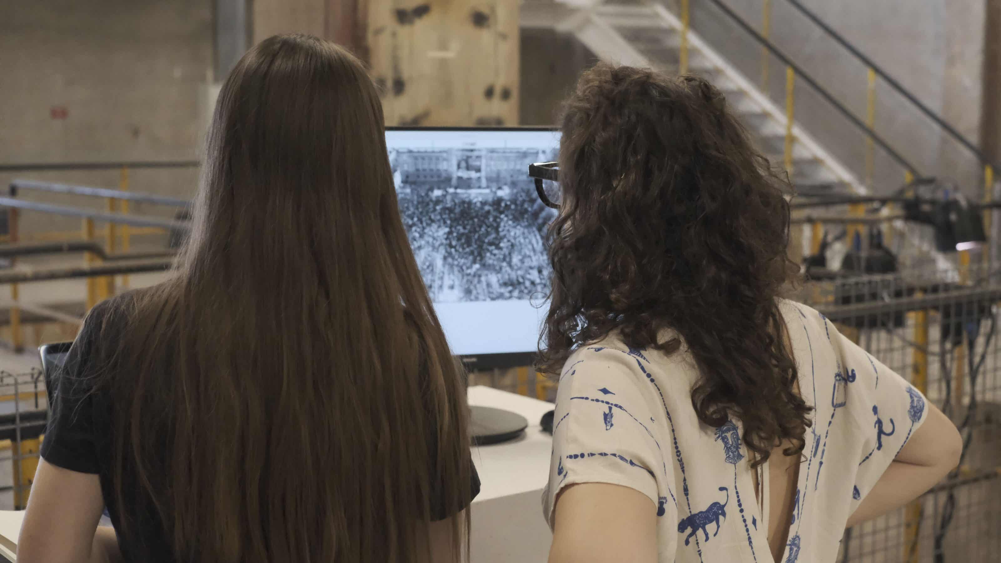
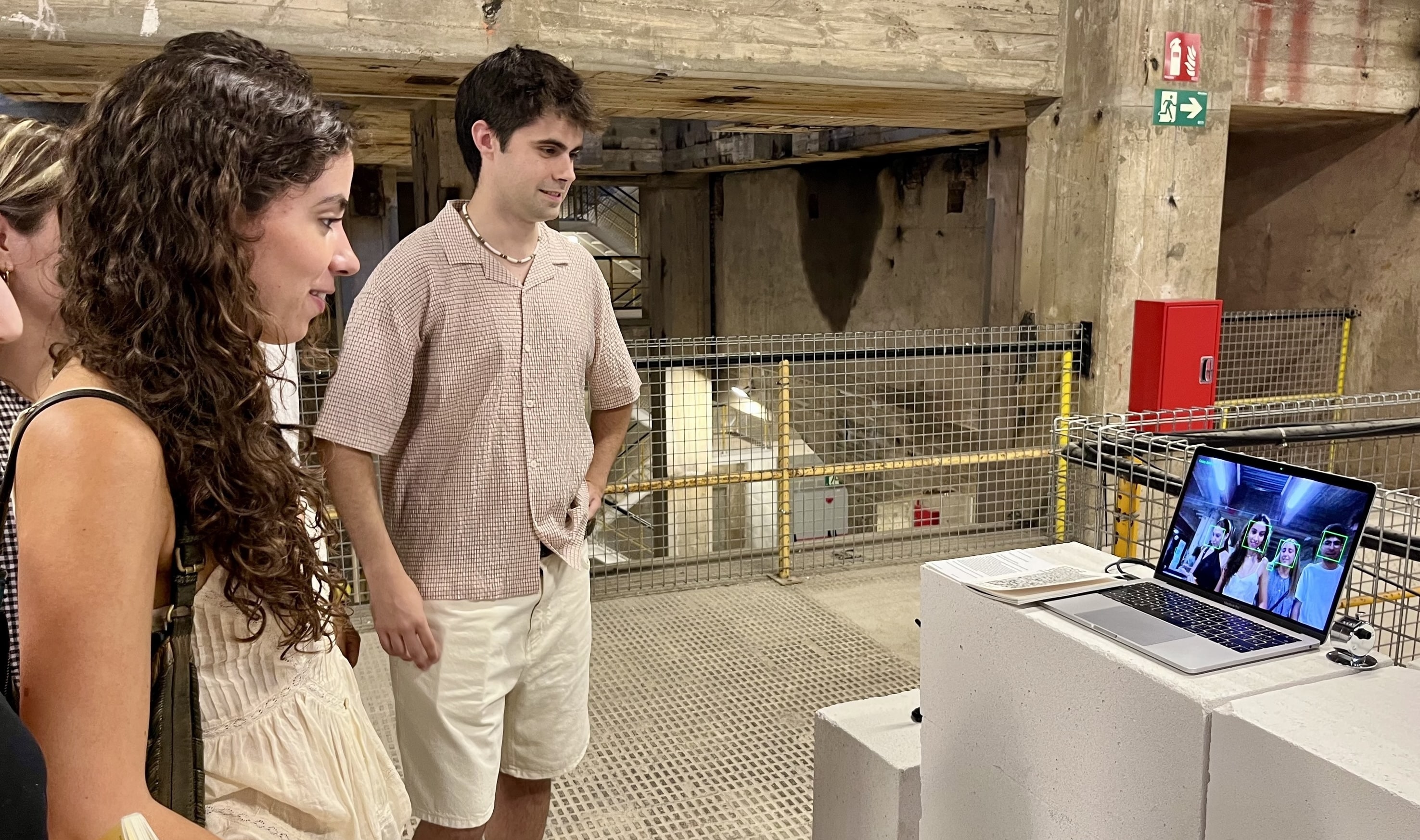
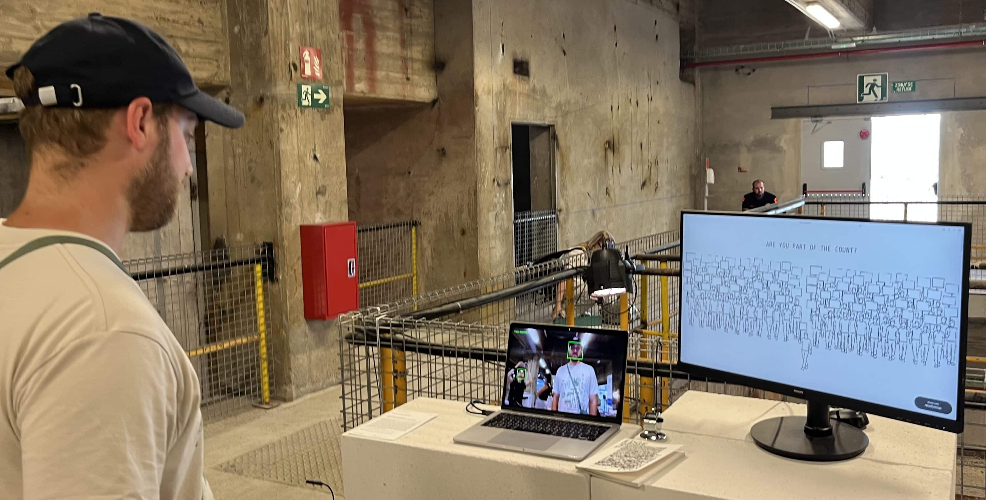
As part of the exhibition, there was also a live face detection feature that counted visitors when they stopped by, alongside a manual counting tool where you could count yourself as being present at the exhibition, highlighting the contrast between automated and human-based counting.
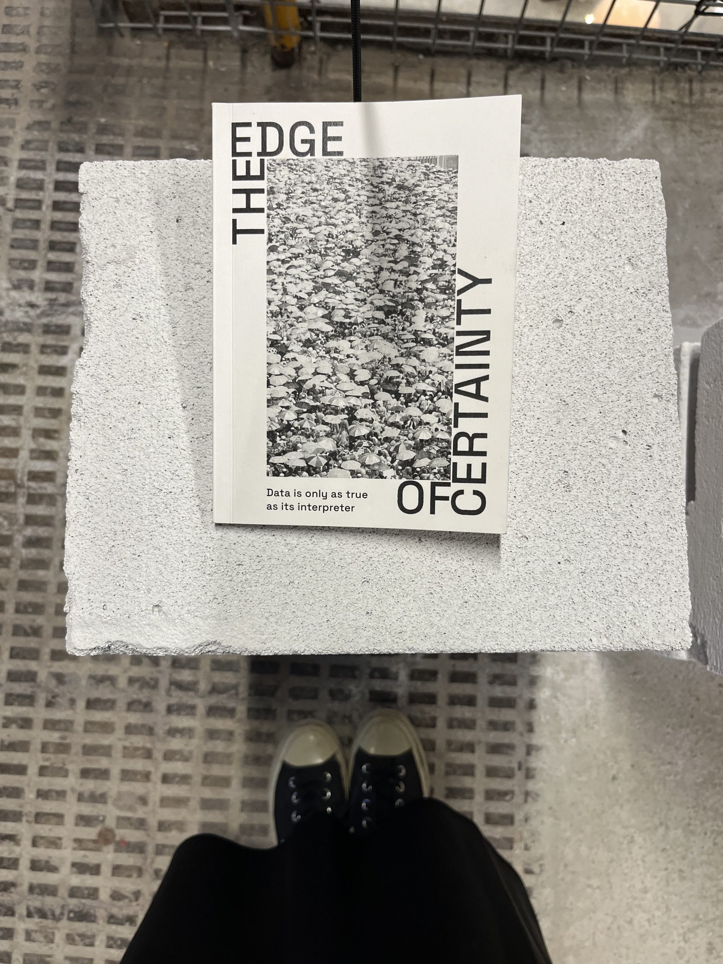
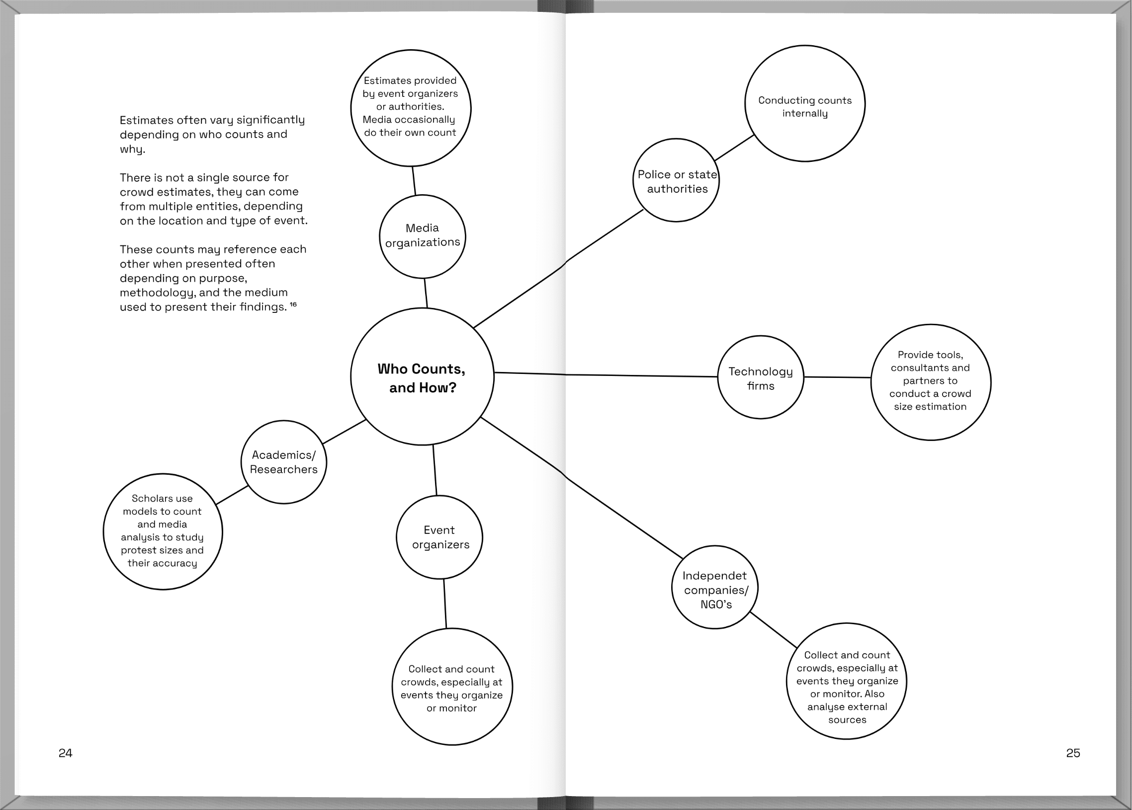
Alongside the interactive piece, I also created a data report that provides broader context for the project.
In my data report, I discuss who counts and why, highlight some of the most striking cases of conflicting crowd counts that are still debated today, and explain how our media exposure shaped by both our behaviour and algorithms affects which numbers we see in the end.
Expanding our media reach can help us encounter different perspectives and move beyond our usual information bubbles.


